Challenge
Approachable to an everyday customer base
Weere Family Distillery wanted to create a brand identity that was welcoming and inviting to people of all backgrounds and income levels. This meant creating a brand that was not too pretentious or exclusive. The brand identity should also be easy to understand and remember.
Reflecting its commitment to sustainability
Weere Family Distillery is committed to sustainable practices at every stage of the distillation process. This includes using locally sourced ingredients, reducing waste, and using renewable energy sources. The brand identity should reflect this commitment to sustainability.
Unique selling proposition
Weere Family Distillery's unique selling proposition is its use of locally sourced ingredients and a holistic approach to the distillation process. This means that the distillery's products are not only delicious, but they are also sustainable and produced with care. The brand identity should highlight this unique selling proposition.
Solutions
Packaging
Naming
Brand Development
Identity System
Launch Campaign
Content Media Data Base
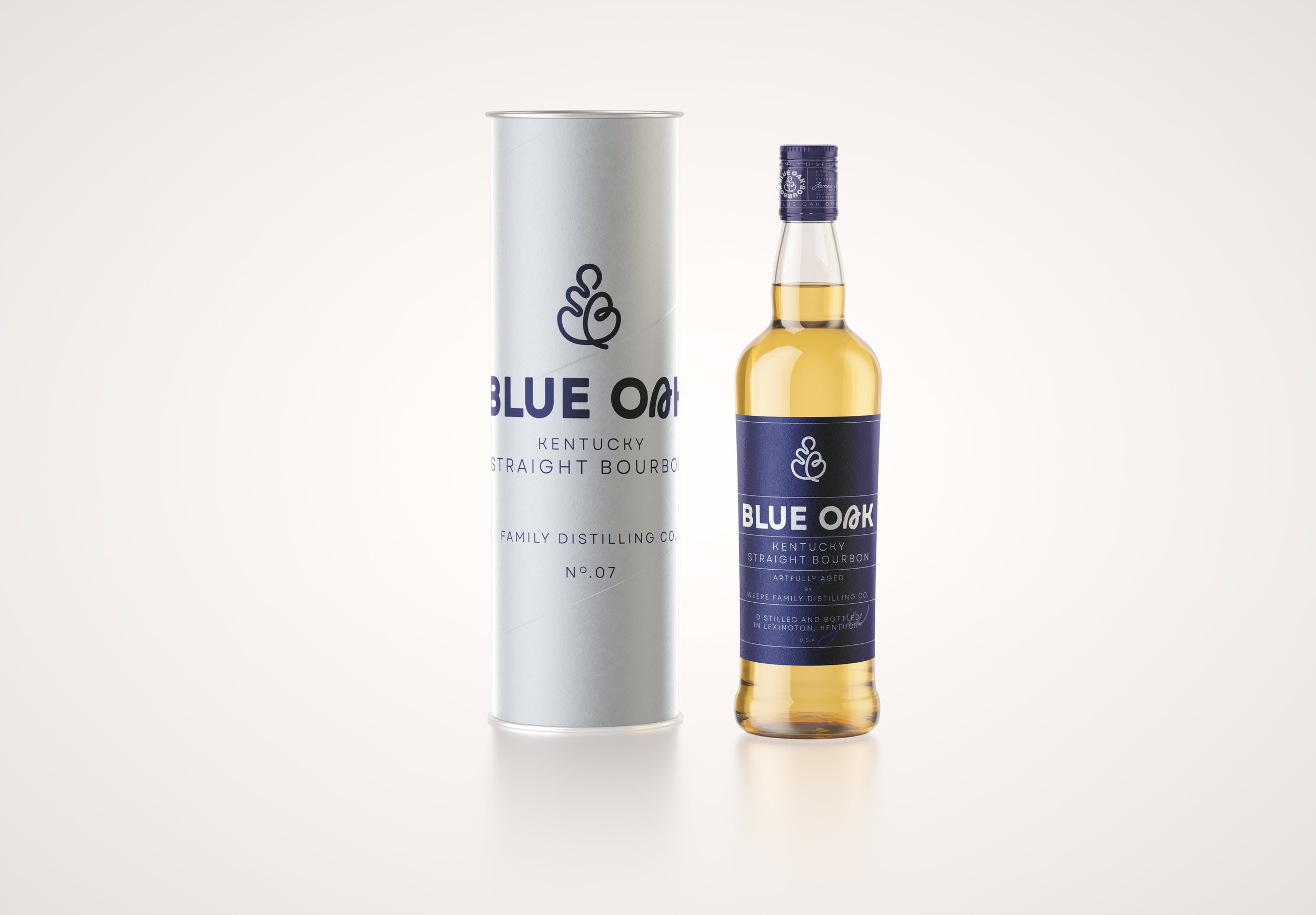
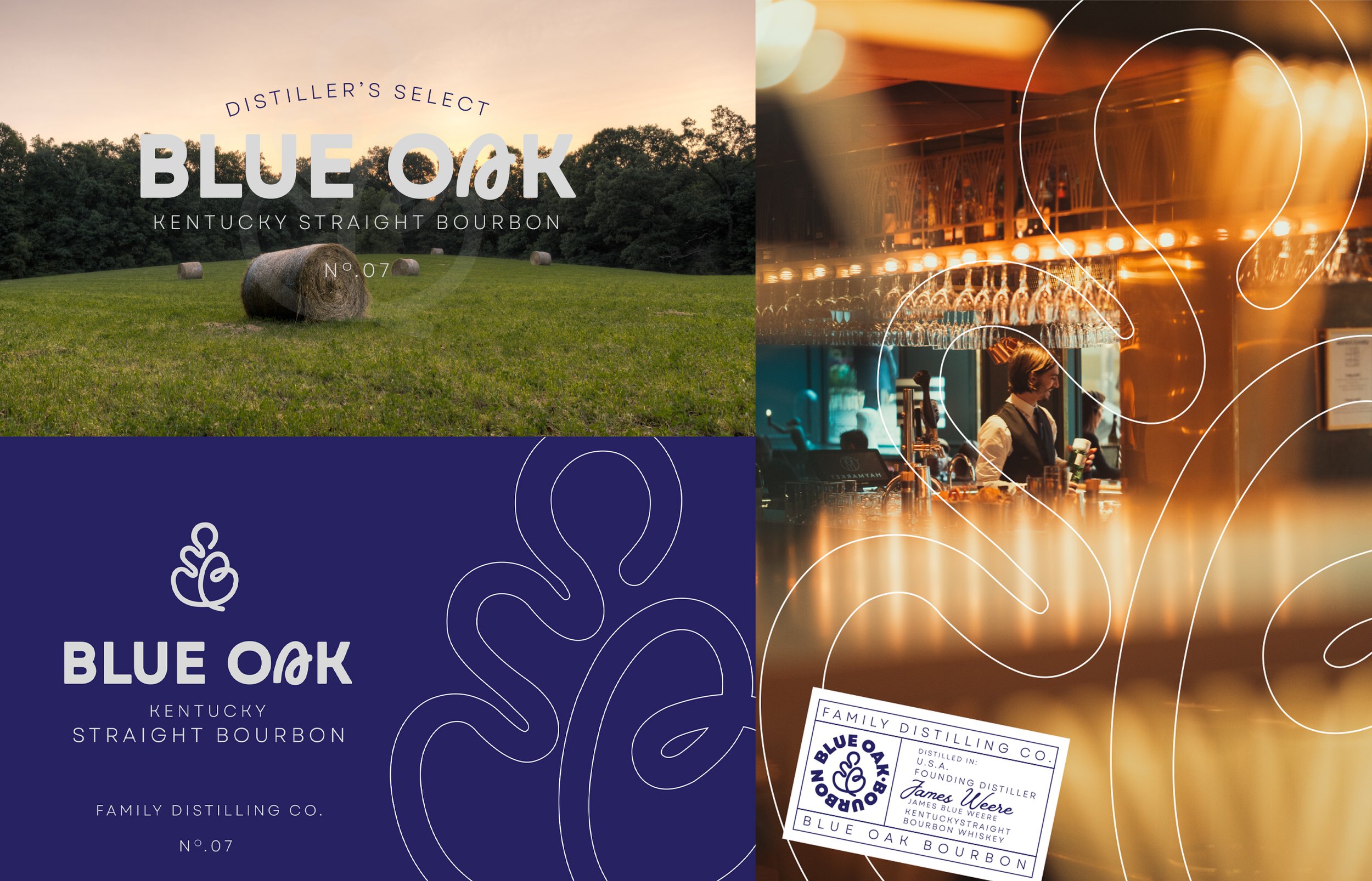
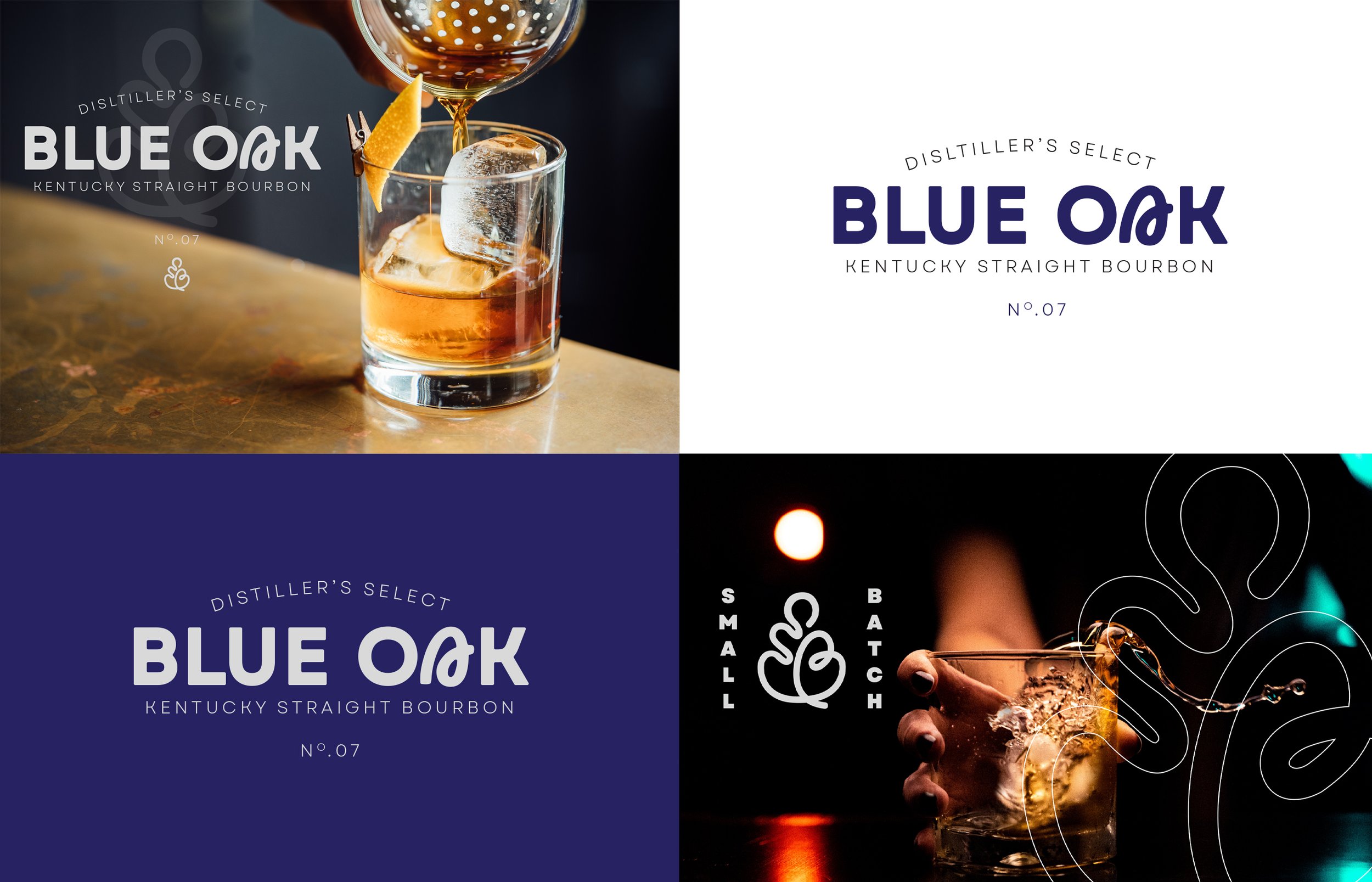
I worked closely with the client to develop a brand identity that is both approachable and aspirational. The logo features a stylized “B” character in the shape of an oak leaf, which is a native tree to the region where the distillery is located. The leaf symbolizes the distillery's deep connection to the land and its commitment to sustainability. The typography is simple and elegant, and the color palette is cool and inviting, reflecting the distillery's welcoming atmosphere.
In addition to the logo, I developed a comprehensive brand identity system that includes brand guidelines, packaging design, and marketing materials. The brand identity system is designed to be consistent and cohesive across all touchpoints, from the distillery's website to its social media pages to its on-premise and off-premise marketing materials.


